Mar 10 2025
I have recently started expanding my business to have a higher emphasis on creating marketing collateral. I find printed material to be a delightful contrast to web/ux design. Whereas web design and UX are grandiose interactive digital media, Printed marketing material allows me to take a break from the computer and focus on smaller project that have a higher focus on printing & materiality. Naturally, when working with smaller business, this tends to be a blind spot when considerations are made. In this guide I hope to cover the basic aspects of printable material that often gets glossed over.
This will act as an introduction for businesses that are looking to print off various means of marketing collateral; with the hopes that this guide will cultivate and direct decision making when discussing these matters. I will be using Ask Mowawk’s “Printing Basics” and “Paper Basics” as the foundation for this discussion. I recommend anyone who is looking to familiarize themselves from a designer standpoint, to check out the documents themselves. My focus today is informing business owners and intrapreneurs who are looking for preliminary information to help cultivate discussion with their designer. With that said, lets get started.
Weights
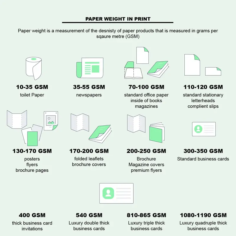
“American paper manufacturers make paper to a weight standard, called the basis weight. Basis weight is determined by weighing 500 sheets of any grade of paper in the proper basic size.” - Ask Mohawk
The weight of the paper helps inform the thickness of the material. Paper of a lighter weight will feel airy and flimsy. Generally thin weighted papers are used when considering quantity. For instance, unless your goal is to build a large tome, a large manuscript lends well to light paper to keep the weight of the book in check. To the contrary, using lighter weight paper for collateral such as posters and business cards makes the object feels cheap. Thicker papers lend to a more substantive feel. However, they can also make the collateral feel bulky and awkward when used improperly.
Textures
Texture also has a large role in how a user interacts with the collateral. The Strathmore Premium Grandee Felt Bright White 80 cover/216 gsm is a relatively thick paper with a felt texture. The texture and weight of the paper combine to create a formal and refined feel for the parchment. With a proper combination of a rich ink, this paper exudes a professionalism.
In comparison, the Mohawk Via Linen Bright White 80 cover/216 gsm has a velvety smooth feel to the paper. This gives the paper a softer, smoother and friendlier vibe to most other papers. The feeling of the paper somehow feels inviting. Unfortunately, the concept of feel is an alien concept in digital media. I cannot vicariously feel the paper in a literal way, I am confined to the limits of vernacular. However, what I can stress the importance of considering this tangible aspect of materiality. If possible, when talking about materiality have your designer show you print examples so that you can see and feel the differences of the options.
Weight and Texture is not just about the feeling of the document. It also informs the display. If you have ever compared an original painting to a printed copy, you know what I am talking about. A grooved textured print influences the way light interacts with the paper. Because of the grooves, the paper is able to reflect and absorb light, either transforming the piece or informing it. In addition some paper formats inform the texture while also having a functional purpose. The Mohawk chromolux Cover 700 High White 9.5pt/215 gsm is cast coated, lending more in line to a professional photograph. As described in Paper Basics “Coated papers have a coating added on their surface before calendaring. Coating restricts the amount of ink that is absorbed by the paper and how the ink bleeds into the paper. This is desirable for sharp and complex images because the ink stays on top of the paper increasing the sharpness of the printed image.”
Material Considerations
Paper remains the default material used for print productions. However, it is not the only option. For instance, you can order business cards made of plastic, wood, and cotton. I have even seen business cards made of textile and metal. When considering materials outside of paper, be aware of the purpose and cost. A metal business card could look very striking, but you must consider how you will get the information on the card. Also consider how it will affect your end user. How will that user carry the card, store it, hold it without cutting him/herself and so forth. Some alternate options, such as cotton and plastic are more assessable, with available printing from companies such as Primoprint and Moo.
Package Considerations
It is important to also consider factors outside the print itself. Let’s say you are doing mail in fliers. Traditionally you may want to just purchase some fliers and ship them as is. This works for most small businesses, though in some instances you may want to include an envelope. Your designer can take care of the writing to format for such a selection, however the design for a marketing envelope compared to a loose flier is different. In some cases, you may want a more elaborate setup. In any event where you are sending invitations, the invite may include various assortment of stationery and flourishes. Understanding the content informs the presentation.
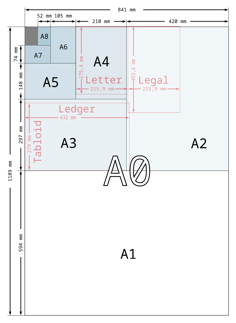
Sizes
“Each size in the A range is half the area of the proceeding size(the squared dimensions) but the proportions remain the same. This facilitates the enlargement or reduction of illustrations and text within the range of sizes. The A4 size normally is used for trade literature, government publications, journals, specifications, bills of lading, letterheads and contracts.” - Ask Mohawk
The size of a document should have a direct correlation with relationship of the material with the user. It can be good to have a heft for parchment you are holding, but you typically don’t want it to be unwieldy. Conversely, a poster of small rapport would be hardly noticeable by walking passerby. Designers consider how the end user is going to interact with material. This can influence the composition size, type, and color. Generally speaking, your designer will guide you on the best file formats for various cases.
Conclusion
This page will act as a growing repository of basic printing knowledge. Feel free to contact me to request for additional printing information.
2015 Ask Mohawk Paper Basics "mohawkconnects.com"
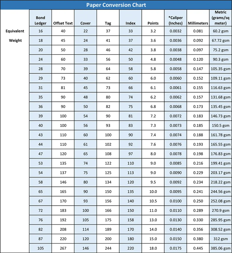
Addendum A: Paper Conversion Chart